We’re all watching a lot of online video at the moment. But when you do so, how often do you notice the aspect ratio of what you’re watching?
If you’re wondering what an aspect ratio is, then the answer might be “not at all”. But if I point out to you those black bars that often appear at the sides or along the top of a video as you’re watching on YouTube, or even on your TV, you might suddenly start noticing them all time. So what are aspect ratios, and why do they matter in video production and online use?
What is an aspect ratio?
An image or video’s aspect ratio refers to its width and height, and is expressed in the form of a number such as 4:3 or 16:9. These numbers mean that for every measurement in the first column (width), you get the number in the second column (height). So at 4:3 aspect ratio, an image four metres wide would be three metres high.
Traditionally, the decision as to what aspect ratio to present a video in was determined entirely by the technical requirements or limitations of the format it was being presented in. But increasingly in the digital era, choosing a particular aspect ratio has become a stylistic decision – and on social media and other online platforms, that decision can be an important one.
Cinematic origins
In the earliest days of cinema, filmmakers had little choice other than to project in the 4:3 (or 1.33:1) aspect ratio that the 16mm film they were using came in. But this quickly changed when soundtracks were introduced, and a small strip was added to include the audio, reducing the available area to 1.37:1.

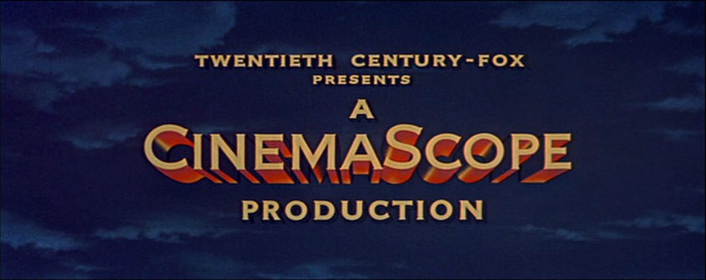
This format managed to dominate well into the introduction of television, and is the reason why most early TV sets looked like square boxes. But in order to compete with television and offer something new, anamorphic lenses were developed that – through the use of some clever optics and processing – squeezed a super-wide image (which was then de-squeezed on projection) known as Cinemascope, or 2.35:1, onto the limited space of 16mm film.
In the decades that followed, a variety of different “wide” formats were trialled, including 1962’s Lawrence of Arabia showing its stunning vistas in a 2.20:1 ratio; and the popular IMAX format, first created in 1970, which allows for much taller views in a 1.43:1 ratio.
Going HD
When movies shot in these wide formats made their way onto square televisions, however, viewers had a problem – the screen was just the wrong shape. Various unsatisfactory methods of converting movies for TV were employed, but neither “letterboxing” (adding black bars above and below the picture) nor the dreaded “pan and scan” (cropping the sides of the image) were particularly satisfactory.
All that changed in the 1990s with the advent of HDTV, and the popularisation of widescreen home televisions. The engineers developing this format settled on 16:9 (1:78) for the aspect ratio, as it was the geometric mean between the 4:3 of television and an average movie ratio of 2.35:1. This meant that although letterbox bars were still often necessary, they were usually smaller than previously required.
(A side-effect of televisions going widescreen, however, was what to do when showing old 4:3 shows. As some viewers don’t like having black bars at the side of the screen, many TVs stretch the image by default, which is less than ideal. And Disney+ faced widespread criticism when adding The Simpsons to its platform, due to cropping the picture and in some cases actually ruining jokes in the process!)

The digital era
Although 16:9 became the accepted standard for video on computer and TV screens, the advent of smartphones and then social media changed everything yet again. Although phones could of course be rotated to view widescreen video, the wide range of different screen sizes meant that once again, there was no standard ratio, and letterboxing became inevitable yet again, especially once bevel-free phones became trendy.
But more significantly, social media meant a shift yet again in the best way to cut and present videos. Sites such as Instagram, Facebook and Twitter saw better results and engagement from square videos than those in either landscape or portrait format, as these videos better filled the available screen space (when subtracting headers and menus) in a news feed. This has led to the bizarre scenario of movie studios releasing on social media trailers for films that have been shot in widescreen ratio, once again featuring the dreaded side crop – as if they were being shown on TV back in the 1980s!
Aspect ratio as style
Although certain ratios are optimal for social media platforms and the like, viewers have generally come to accept that the size of a video might not match the size of the screen it’s played on. As such, the decision over which aspect ratio to use is generally now less of a necessity, and more of an artistic choice. In the indie and arthouse scene, 4:3 has been steadily rising in popularity, with Robert Eggers’ Lighthouse and David Lowery’s A Ghost Story both using it as a great way to enhance themes of confinement or paranoia.
In the online space, filmmakers have been using aspect ratios as an artistic choice for a number of years now. Ben Dean’s Kitt, a stylised video that gives an insight into Melbourne-based artist Kitt Bennett, plays fast and loose with ratios, rapidly changing from 4:3 to 16:9 to 2.39:1 depending on the context of the scene.
The Social view
While we enjoy creative use of aspect ratio for artistic effect, for the requirements of our clients, we usually find that a tried-and-tested 16:9 format is the most flexible and adaptable way to present their videos. The My Home Town videos that we’ve produced for National Lottery Good Causes are an example of this “classical” style:
At the same time, we’ve found ourselves sometimes taking a more cinematic approach, such as in our work with Marketing Manchester, where we employed 2.35:1:
The important thing for us is always that our videos have the best chance of being seen, enjoyed and engaged with in the best way possible. Ensuring that the aspect ratio is not a barrier to that, or an unnecessary distraction, is just a part of how we ensure we’re delivering great work that meets the client’s needs.


